Enhancements to chart component in Studio (2024-06-11)
We've made a number of enhancements to our chart component in Studio, improving the look and feel of your new Views. These updates include:
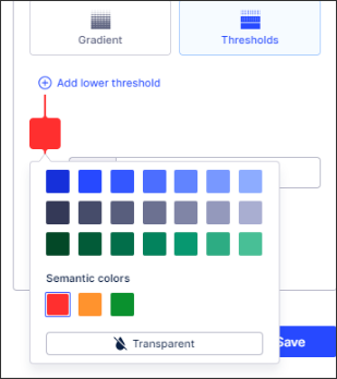
- Additional colors: Adding to blue, gray, and green, you can now also select from semantic colors: red, green, orange, and a transparent color option.
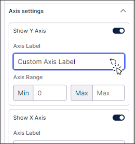
- Revert axis title: You can now revert your axis titles back to their default labels.
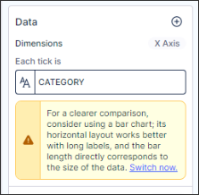
- Alternative chart types: Improved messaging when alternative chart types are better suited to the data you've selected.
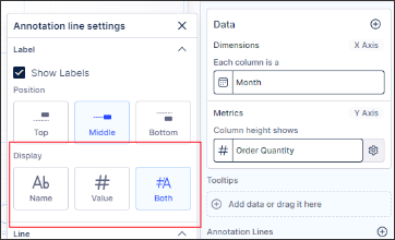
- Display options for annotation lines: You can now select between name, value, or both for your chart annotation lines.
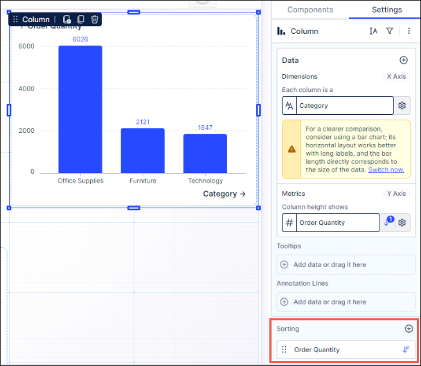
- Sorting categorical column charts: You can now sort categorical column charts, choosing between ascending or descending orders.
For more information about creating and configuring the chart component, see: Charts.

