For E.G.: I want to show comparison of year 2024 Vs 2023 in a bar chart (VIEW)
Hi @apurva.patha12,
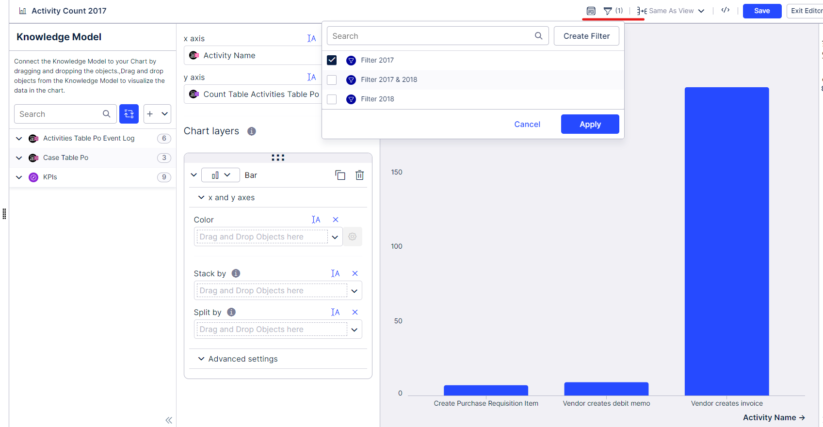
It depends how you want it. For a simple solution, you can create two filters in your Knowledge Model with the following code:
FILTER YEAR("ACTIVITIES_TABLE_PO"."EVENT_TIME") = 2018;
FILTER YEAR("ACTIVITIES_TABLE_PO"."EVENT_TIME") = 2017;
You can then apply these filters to two identifical tables for comparison.
For instance, in the image below I applied the 2017 filter. In another table, you can then do the Filter for 2018. In your case of coure, it would be 2023 and 2024
Let me know if you need more assistance. 😎
Hello Sverre,
I am not able to search the file you shared with me. Would you please help me to understand where I can look for it?
Thank You.
Hello Sverre,
I am not able to search the file you shared with me. Would you please help me to understand where I can look for it?
Thank You.
Hi @apurva.patha12,
Not sure what you mean by 'file', do you mean filter? Happy to help out 😁
Hello,
I have attached the screenshot for reference where i want to replicate exactly the same celonis.
Please advise
Hello Sverre,
Would you please recommend your suggestions on above comment and screenshot?
Hello Sverre,
Would you please recommend your suggestions on above comment and screenshot?
Hello @apurva.patha12,
Terribly sorry for the late response, I have been quite busy.
Thanks for the referential screenshot. I created something similar, but I need more information to replicate what you have shown me. For instance,
- I do not know what the green numbers are exactly.
- What is present on the Y-axis?
If I have more info on the two bullet points above, I can help you further.
Let me know if the below is something like what you are currently looking for, then we can work it out together. 😎
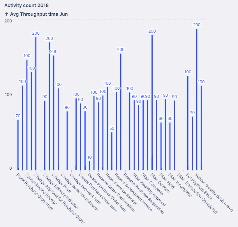

Green numbers are representing how much data has been increased from previous year and red colour indicate how much it has been decreased from previous year.
* What is present on Y-axis?
Numbers of the current year and difference between current – previous year
Regards,
Apurva Pathak
Senior Consultant-Celonis
Fresenius Kabi India Pvt. Ltd.
Hello @apurva.patha12,
Terribly sorry for the late response, I have been quite busy.
Thanks for the referential screenshot. I created something similar, but I need more information to replicate what you have shown me. For instance,
- I do not know what the green numbers are exactly.
- What is present on the Y-axis?
If I have more info on the two bullet points above, I can help you further.
Let me know if the below is something like what you are currently looking for, then we can work it out together. 😎

Would you please reply to below mail?
Regards,
Apurva Pathak
Senior Consultant-Celonis
Fresenius Kabi India Pvt. Ltd.
Hello @apurva.patha12,
Terribly sorry for the late response, I have been quite busy.
Thanks for the referential screenshot. I created something similar, but I need more information to replicate what you have shown me. For instance,
- I do not know what the green numbers are exactly.
- What is present on the Y-axis?
If I have more info on the two bullet points above, I can help you further.
Let me know if the below is something like what you are currently looking for, then we can work it out together. 😎

Hi Apurva
I have been trying to replicate your inquiry, but sadly I was unable to. I would suggest you to start a ticket to have the Celonis Team help you out.
regards,
Sverre Klein
Reply
Enter your E-mail address. We'll send you an e-mail with instructions to reset your password.
