

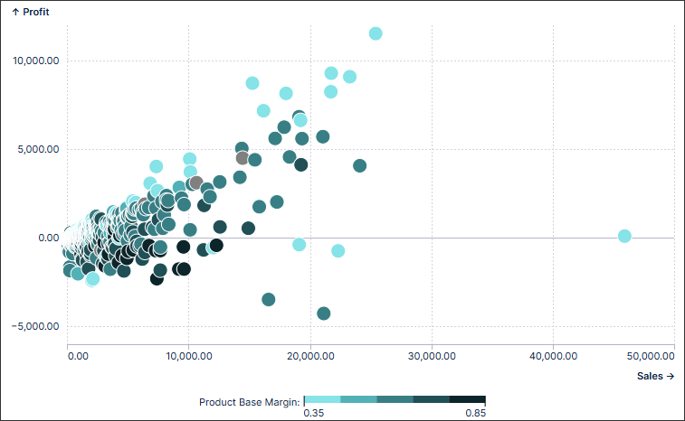
You can now add and configure scatter plot charts for your Studio Views. Scatter plot charts (also known as bubble charts) are a great way to display a lot of related data in one chart. In scatter plot charts, the x-axis displays one numeric field and the y-axis displays another, making it easy to see the relationship between the two values for all the items in the chart. In a bubble chart, a third numeric field controls the size of the data points.
In this example, a scatter plot chart is used to map profit against sales:
To learn more about the different chart types you can configure for your Studio Views, see: Available chart types.
And to understand how to create and configure these charts, head to: Charts.