Hi,


I got this chart in studio in a regular analysis and want to create the same chart in a view/km.

The chart has as dimension ROUND_WEEK("ACTIVE_USERS"."DATE"). so it shows the value on a weekly basis,


image 

How can I create the same chart in a view? the only way I found to have round_week dimension is to create a KPI in the knowledge model and use that but it does not nicely display the chart:

imageHow can I change the chart that it shows date for all values and makes the columns bigger with less space in between?

Also I using a KPI the best way for the dimension?


thanks


Roan

Hi @roan.schuu13,


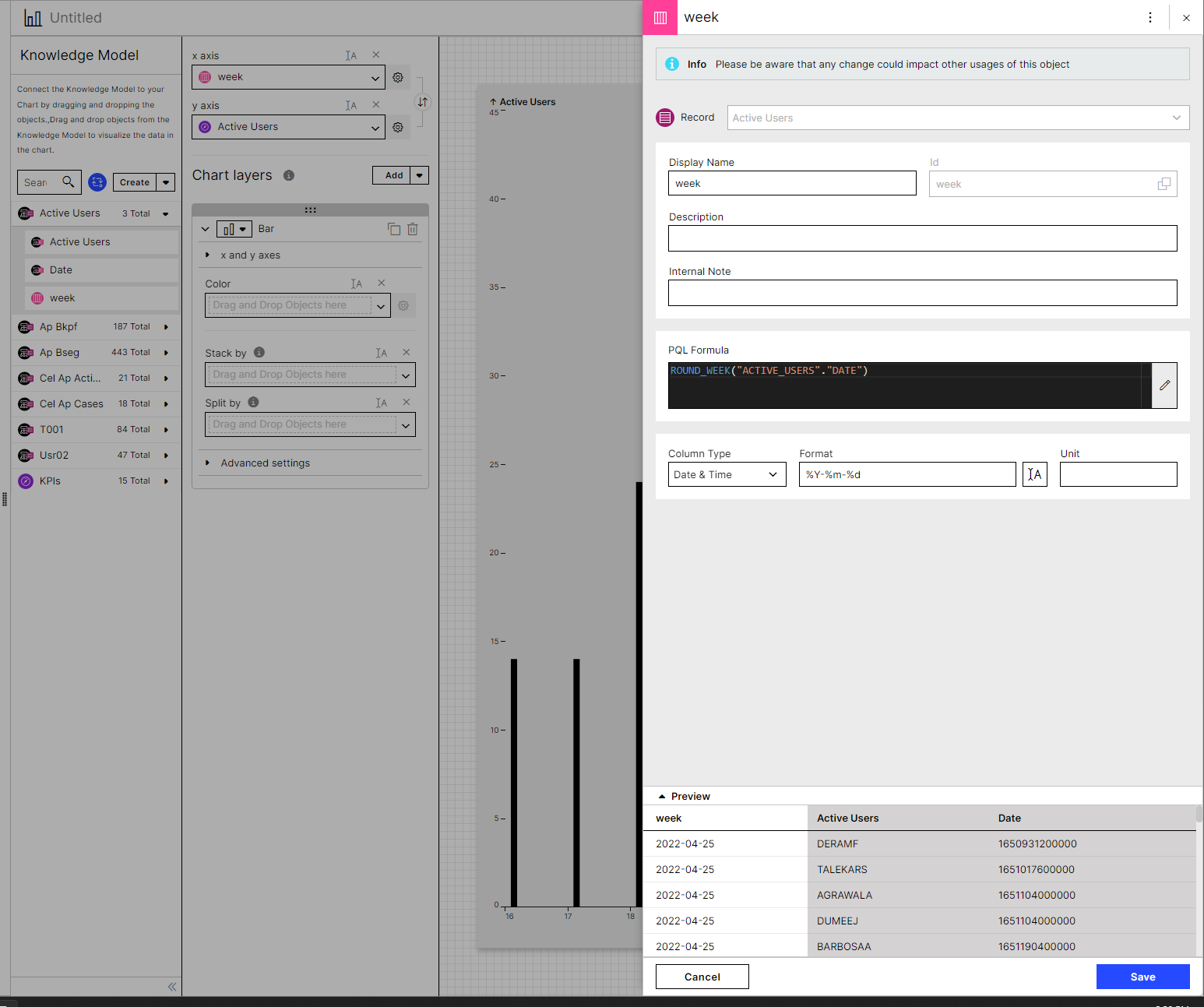
Could you post a screenshot on how you created the attribute? A problem could be that in the format you're still specifying the day. In case try something like %Y-%m


The attribute looks as follows.image 

It seems that it only shows the bar on the first day of the week and other days are empty (and not visible) or it aligns to left. I cannot change the size to make it bigger.


The attribute looks as follows.image 

It seems that it only shows the bar on the first day of the week and other days are empty (and not visible) or it aligns to left. I cannot change the size to make it bigger.


@roan.schuu13 

try by clicking on the button next to format then delete '-%d'


tried to change the formats but it doesn't have the desired effect. Also what I notice is that round_week makes the start of the week on Monday, and the chart dimensions have a start date of Sunday. is that something I can change? this hasn't been an issue in the ' old' analysis.


image


Reply