Hi everyone,

I would like to create a color mapping for a KPI in a OLAP TABLE.

imageEach row in the table represents a case, with ID, an attribute from the same table (numeric), and a KPI created on that attribute (also numeric).

I would like to color the value of the KPI based on the value of that attribute, for each case. For example, if it is greater in red, if it is less in green.

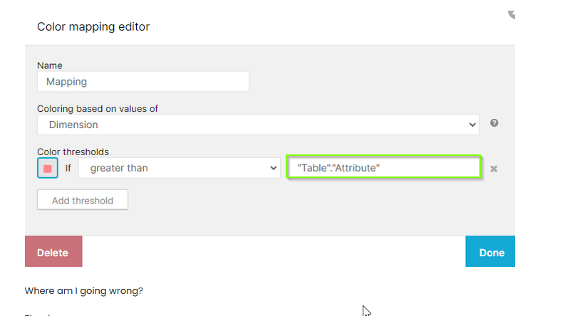
I selected color mapping based on Dimension, and entered the first threshold as in the figure, but it colors everything red, not taking into account the value of the attribute.
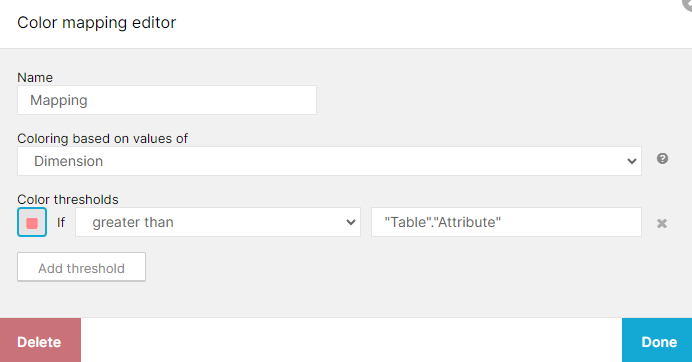
 

image.png 

Where am I going wrong?


Thanks


Hi Enrico,

You need to put a numeric threshold value here, not the name of the attribute you want to use.

If you have multiple dimensions in your table, I'm not sure how this will work though.

image


As explained, the threshold is not unique, but changes from case to case.

I always used the numeric threshold when it was fixed (exactly as you told me). But if the threshold is dynamic how do you do it?

What is the utility of mapping based on Dimensions instead on Series?


So, the Attribute is the threshold and you want to color the KPI based on if it's higher or lower than the value of the Attribute?

You could try creating a variable with the same PQL as your Attribute and use that in the color mapping. Because you can use variables for sure. And I think in that case you would still use the Coloring based on values of Series - not the Dimension.

If I remember correctly, coloring based on Dimension can be used for text values but I couldn't find a good example for that.


it works. Thank you very much.

I set a static value variable on the attribute, then I set the color mapping based on Series on that variable.


Reply