Hi all,

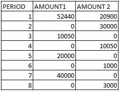
I want to create a Column Chart which takes sum of amounts of two different tables having period numbers. Attached is the sample data -
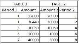
https://aws1.discourse-cdn.com/business6/uploads/celonis4/original/2X/c/c01595072c5d71e8484a5975bd84dd195c382311.jpegExpected Output in Column Chart -

https://aws1.discourse-cdn.com/business6/uploads/celonis4/original/2X/2/214783338293b36443f94ac6e05da86397e5600e.jpegI tried to create the Column Chart but my values are not coming correct.
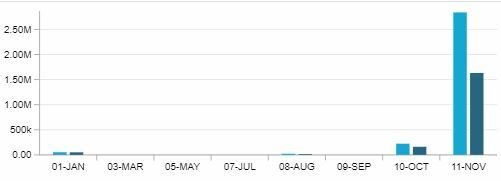
https://aws1.discourse-cdn.com/business6/uploads/celonis4/original/2X/2/21219ba3dc29c549ab60a1fc38e7e9a4c3ed73a3.jpegIs there any solution so that my column chart will take data from two different table and populate the values correctly.

Help appreciated!!

Thanks,

Pooja

@pooja.tiwar11 In the config of the Chart, there is the option to stack the KPI's. This should do the trick 😉 since you have the same timeseries.


Best

Kevin


Hello Pooja,

stacking columns will not solve your issue as the date dimension is coming from different tables.

I see 2 options here

  1. Easiest one is to create 2 separate charts (no brainer)
  2. Ensure in the backend that these two tables have a direct match between the desired date dimension and the two columns being aggregated. For example, if table A has info about the creation date+Invoice Amount and table B has payment date+Invoice Amount, you need to pick one of these dates and aggregate it

Best,

Gabriel


Reply