Question

Stacked bar chart

  • August 13, 2019
  • 7 replies
  • 70 views

Hello, Is it possible to create a stacked bar chart with Celonis ? Thank you for your help, Regards Robin

7 replies

Hi Robin, Yes, you can create this in Celonis. To do so please create an Column Chart and create the KPIs you want to stack. Afterwards, in the component options, you need to choose the data series of your KPIs from the dropdown and enable the Box stacked in the data series settings. With this the KPIs will be stacked on one Bar. See the screenshot below. image346540 48.7 KB Best regards, Viana

  • Author
  • Level 3
  • August 13, 2019
Hello Viana, Thank you for your help, it works now. (I didnt think of stacking the datas myself, I was trying to make it work in a pivot table way) Best Regards, Robin

Hi, I think my questions relates to the same topic but is still different as I dont want to create a second KPI. What I want to do is to create a column chart which shows one KPI but differentiates the PO TYP within every column. (see jpg) The chart shows the sum of the volume per Week and PO Typ. Thanks fo your help Unbenannt.JPG937274 22.3 KB

Hi, unfortunately, in Celonis it is not possible to create different dimensions within one KPI. So, to design a bar chart like in your screenshot you can create a KPI for every dimension you want to display within your original KPI. Then, you have to stack these KPIs to generate a differentiated bar in your chart. 
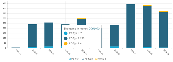
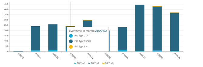
As in your example, you can use a CASE WHEN statement for the single KPIs: Example PO Type 1 SUM( CASE WHEN "VBAK"."AUART" = ' PO Type 1' THEN 1 ELSE 0 END) Best regards, Viana

Forum|alt.badge.img+11
  • Level 2
  • October 16, 2019
Hi Viana, I think the link to the screenshot is broken. Could you please reupload a screenshot of how to stack columns in a column chart? Burke

Hi Burke, please let me know if you see the screenshot now: Best regards, Viana

Forum|alt.badge.img+11
  • Level 2
  • October 22, 2019
Thanks, I see it now