 (part of the diagram with the date range of half a year as example)
Is there any way to only display every second or third label on the dimension axis so it looks less cluttered and more readable?
Ive looked through the component options but couldnt find anything related exept the tick count, but that doesnt help me for this case.
Best regards,
Nils
(part of the diagram with the date range of half a year as example)
Is there any way to only display every second or third label on the dimension axis so it looks less cluttered and more readable?
Ive looked through the component options but couldnt find anything related exept the tick count, but that doesnt help me for this case.
Best regards,
Nils
Question
Reduce the number of shown labels in the dimension axis
 +1
+1Hello everyone,
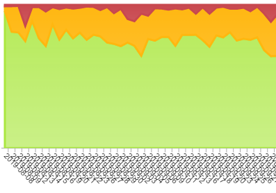
Im currently working on an analysis for viewers which is going to be exported as image, a stacked area chart in the date range of a year.
Now to my problem:
Their requirement is that every workday has to be shown in the diagram, so the dimension axis gets unreadable because of the amount of dates displayed:
(part of the diagram with the date range of half a year as example)
Is there any way to only display every second or third label on the dimension axis so it looks less cluttered and more readable?
Ive looked through the component options but couldnt find anything related exept the tick count, but that doesnt help me for this case.
Best regards,
Nils
(part of the diagram with the date range of half a year as example)
Is there any way to only display every second or third label on the dimension axis so it looks less cluttered and more readable?
Ive looked through the component options but couldnt find anything related exept the tick count, but that doesnt help me for this case.
Best regards,
NilsLogin to the community
No account yet? Create an account
Login with SSO
Celonaut Login Celonis ID LoginEnter your E-mail address. We'll send you an e-mail with instructions to reset your password.