He guys,
tl;dr
how to: One chart with created & completed & open orders, with slightly different filter (including / excluding activities)
Long version
I am analyzing order data and I am interested in visualizing both: created and completed orders, on a monthly basis (The cherry on the cake would be a line with the cumulated difference between created and completed orders increasing amount of open orders).
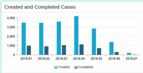
It is not a problem for me to build a Column Chart for created and completed orders (separated):
Created:
Dimension:
ROUND_MONTH(PU_FIRST(S2AE_FINAL_V2A_CASES, S2AE_FINAL_V2A.EVENTTIME))
KPI:
COUNT_TABLE(S2AE_FINAL_V2A_CASES)
Completed:
Dimension:
ROUND_MONTH(PU_LAST(S2AE_FINAL_V2A_CASES, S2AE_FINAL_V2A.EVENTTIME))
KPI:
COUNT_TABLE(S2AE_FINAL_V2A_CASES)
Created_and_Completed_Orders.JPG495509 29.1 KB
But how can I combine these to charts?
I would like to see two columns for each month, with the respective values of created and completed orders.
Ideally with the line of the total amount of my open orders.
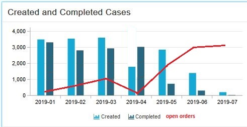
Any suggestions?
Thank you in advance,
Cheers,
Michael


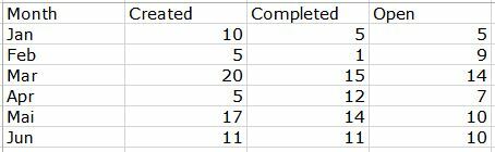 Each row is a month.
In Jan 10 orders were created, but only 5 were completed. Open orders = 5
In Feb I still have 5 orders from Jan, but also 5 newly created orders from Feb minus the 1 order which was completed in Feb. This means, end of Feb, I have 9 open orders.
I hope it is clear now
Each row is a month.
In Jan 10 orders were created, but only 5 were completed. Open orders = 5
In Feb I still have 5 orders from Jan, but also 5 newly created orders from Feb minus the 1 order which was completed in Feb. This means, end of Feb, I have 9 open orders.
I hope it is clear now  Thanks again!
Michael
Thanks again!
Michael I think you can calculate this using the RUNNING_TOTAL function. You can combine both KPIs (subtract the finished orders from the created orders) and then return the running total of this number.
The query would be this:
I think you can calculate this using the RUNNING_TOTAL function. You can combine both KPIs (subtract the finished orders from the created orders) and then return the running total of this number.
The query would be this: