Hi team,


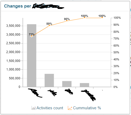
Is there a way to make Pareto charts in Analysis or Views ?

It does not appear to be off the shelf, just wondering if someone managed to build one.

It is a quite comon tool used in the process improvement field.


Thanks

Are you looking to build a chart which contains both a bar graph/histogram and a line depicting a trend?


Want to make sure I'm understanding what a Pareto chart is. Did some research and found some examples and was not familiar with them as Pareto charts.


Are you looking to build a chart which contains both a bar graph/histogram and a line depicting a trend?


Want to make sure I'm understanding what a Pareto chart is. Did some research and found some examples and was not familiar with them as Pareto charts.

https://asq.org/quality-resources/pareto#:~:text=A%20Pareto%20chart%20is%20a,which%20situations%20are%20more%20significant.


Looks like it can be done combining a bar chart, ordered, plus an accumulative line chart with the percentages. This second part seems tricky...


https://asq.org/quality-resources/pareto#:~:text=A%20Pareto%20chart%20is%20a,which%20situations%20are%20more%20significant.


Looks like it can be done combining a bar chart, ordered, plus an accumulative line chart with the percentages. This second part seems tricky...


yes, that's exactly what I would like to do @Guillermo Gost 

bar chart ordered (this I can do) + accumulative line chart with percentages.

it is a common tool used to priortised process improvement initiatives.


Are you looking to build a chart which contains both a bar graph/histogram and a line depicting a trend?


Want to make sure I'm understanding what a Pareto chart is. Did some research and found some examples and was not familiar with them as Pareto charts.

@Guillermo Gost  found the perfect definition of the pareto chart from the ASQ website

https://asq.org/quality-resources/pareto#:~:text=A%20Pareto%20chart%20is%20a,which%20situations%20are%20more%20significant


So not exactly the Pareto you're looking for, but here's an example of having both lines and area. You would need to have several layers and you can select different chart types at the layers. Select Bar and then add a layer for Line


imageimage


So not exactly the Pareto you're looking for, but here's an example of having both lines and area. You would need to have several layers and you can select different chart types at the layers. Select Bar and then add a layer for Line


imageimage

thanks

I did found a way to have both bars and line on the same chart, but the trick is to have the line showing a cumulative information.

Thanks for trying though

cheers


thanks

I did found a way to have both bars and line on the same chart, but the trick is to have the line showing a cumulative information.

Thanks for trying though

cheers

Yep, that's why I though it will be tricky.... if you find how, please share!


thanks

I did found a way to have both bars and line on the same chart, but the trick is to have the line showing a cumulative information.

Thanks for trying though

cheers

I'm thinking it would be a MOVING_SUM no?

https://docs.celonis.com/en/moving_sum.html


thanks

I did found a way to have both bars and line on the same chart, but the trick is to have the line showing a cumulative information.

Thanks for trying though

cheers

no, I don't think the moving sum will work, because you need to define the number of rows you want to include in the formula.

However, your idea gave me good hint

the formula that could do the trick could be the RUNNING TOTAL https://docs.celonis.com/en/running_total.html

I will have a go and will post the results here, thanks for the research @matt.witty13 , much appreciated.


Tadaa !!


Thank you for the brainstorm @matt.witty13 @Guillermo Gost , I could not have done it without you.


The orange line was the tricky part, but here it is 😎 .


RUNNING_TOTAL (COUNT("qTable]"."qField]")) / GLOBAL ( COUNT("qTable]"."qField]"))


Pareto Chart


Reply