Hi All,

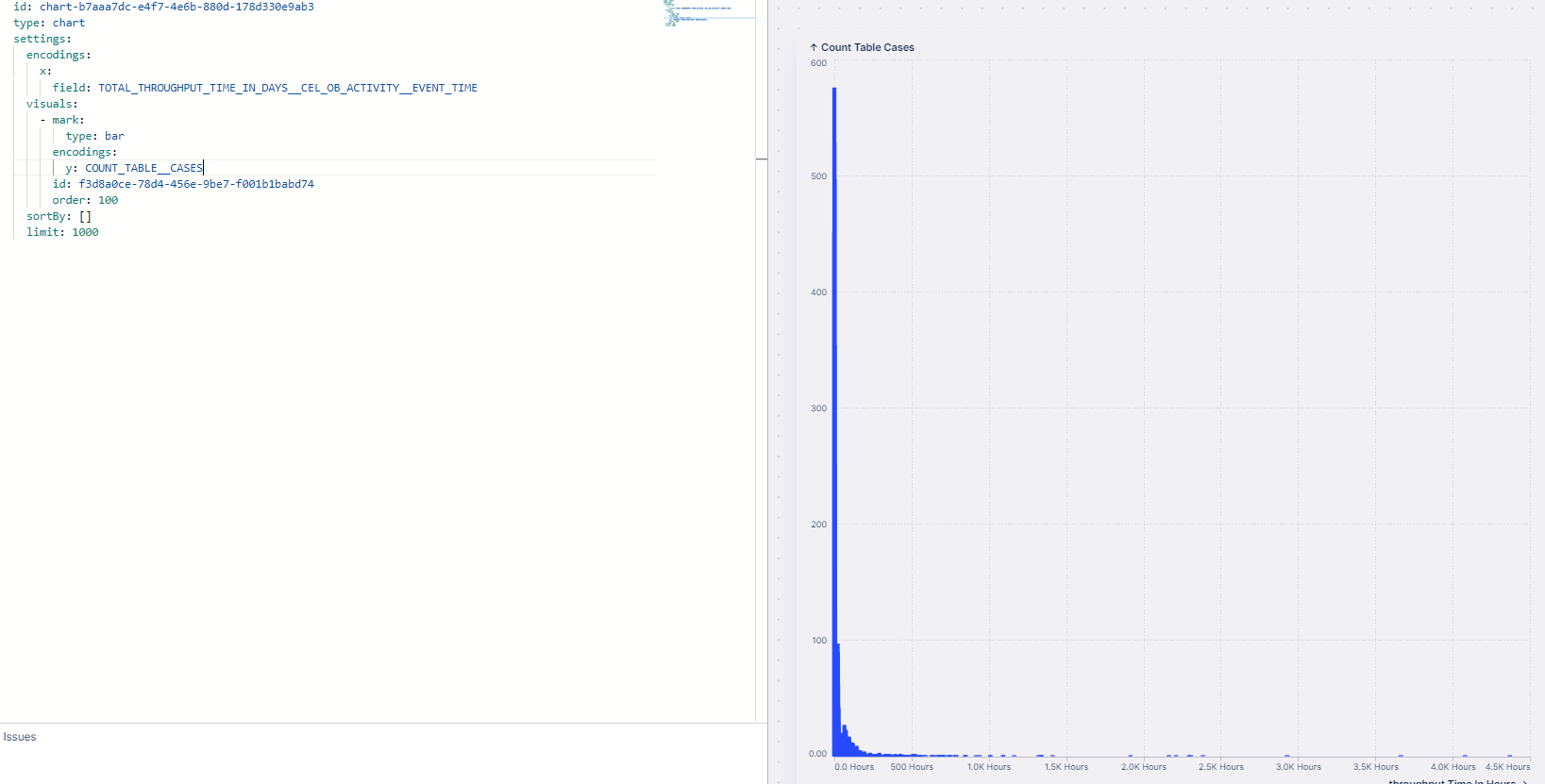
Im trying to find the count of throughput time in buckets in views. The histogram are the way to go but in views they only accomodate integer and floats but not dates. Im trying to come up with it in Chart but unable to.

Please let me know if someone has any idea.
image

Hi @Rahul Bhat,


If I understand your problem correctly, would be the first step to calculate the throughput times as a number and use this as X-axis? You then do not need to use dates in your graph.


To calculate the throughput times in hours, use:

CALC_THROUGHPUT ( CASE_START TO CASE_END , REMAP_TIMESTAMPS ( "<Activities>"."<Timestamp>" , HOURS) )

(see https://docs.celonis.com/en/throughput-times.html)

Replace here the "<Activities>"."<Timestamp>" with the Activity Table and Timestamp column of your data set.

To get the number of cases on the Y-axis, use the COUNT_TABLE("<Case_Table>") function (see COUNT_TABLE (celonis.com))


I hope this helps.


Cheers,

Jan-peter


Hello @janpeter.van.d 

Thank you for your suggestion. Below is the screenshot with your suggestion.

image 

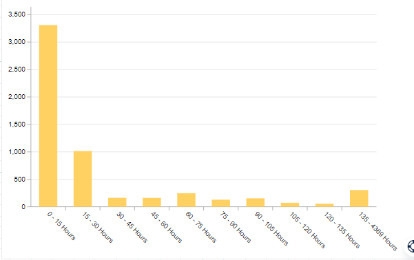
But i would want them in buckets. like 0-10 10-50 50-100 ...

As in histogram.

Would be helpful if you suggested me about that.

Thanks


Hmm, I see your point.


I have a couple of options:

  1. Try to set the x-axis to a different scale type (click on the wheel icon, see screenshot below)
  2. Use Round to automatically make buckets (of the same size). In this example the Throughput time is rounded to the nearest ten. Replace 'x' with your throughput time formula.
    1. ROUND(x /10)*10
  3. Create Buckets manually using a CASE WHEN statement.
    1. CASE WHEN x BETWEEN 0 AND 10 THEN '0-10 hours' WHEN x BETWEEN 10 AND 50 THEN '10-50 hours' END


Unfortunately, these are still workarounds to mimic the function of the Histogram, but hopefully it helps.


Try using a histogram for this! You would need to add the throughput time as an attribute to your case record (remember to explicitly set the column to an int or float). Buckets in charts are a real pain in my experience.


If you name the attribute CASE_RECORD_ATTRIBUTE_WITH_TPT, the yaml for the histogram would be:


id: histogram-celonis-generated-guid

type: histogram

settings:

attribute: CASE_RECORD_ATTRIBUTE_WITH_TPT

Hi @sujeevan.ferru13  Thanks a lot this worked


Try using a histogram for this! You would need to add the throughput time as an attribute to your case record (remember to explicitly set the column to an int or float). Buckets in charts are a real pain in my experience.


If you name the attribute CASE_RECORD_ATTRIBUTE_WITH_TPT, the yaml for the histogram would be:


id: histogram-celonis-generated-guid

type: histogram

settings:

attribute: CASE_RECORD_ATTRIBUTE_WITH_TPT

Cool, I wasn't aware that the Histogram was available in Studio yet. Thanks for sharing!


Reply