Question

Hi, I would like to know how can I build the same Chart below (Throughput times from Process Overview) in the dashbord using the button " COMPONENT +" in the Studio. Time duration between two activities that are neither the start nor the end of

  • December 27, 2022
  • 2 replies
  • 8 views

Forum|alt.badge.img+11


From "COMPONENT+"image.png
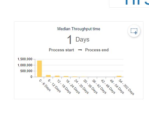
I would like to create a same in the dashbord (figure below from Process Overview).
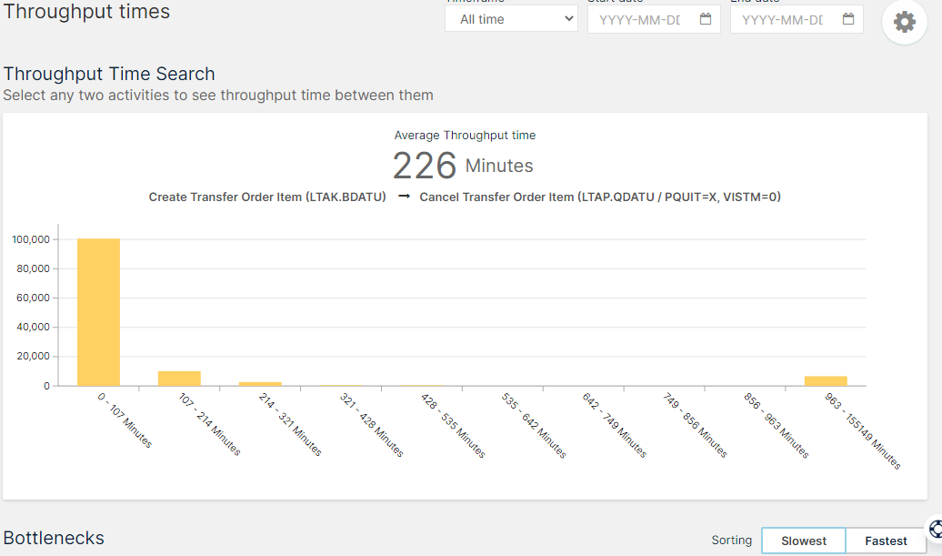
image.png

2 replies

andré.tafur
Level 8
Forum|alt.badge.img+15
  • Level 8
  • December 28, 2022

Hi,

I think you are looking for the Throughput Time Search component, when you click in the "COMPONENT +" button you will find this component right here:

imageYou can also select the activities you want to analyze, change the measure (average, median, max, min) the documentation will help you with more information:

https://docs.celonis.com/en/process-components.html#UUID-4bb09c7a-1588-1f32-52fa-1d8ff5901fe1_id_ProcessComponents-Throughputtimesearch


Best regards.


Forum|alt.badge.img+11

Hi,

I think you are looking for the Throughput Time Search component, when you click in the "COMPONENT +" button you will find this component right here:

imageYou can also select the activities you want to analyze, change the measure (average, median, max, min) the documentation will help you with more information:

https://docs.celonis.com/en/process-components.html#UUID-4bb09c7a-1588-1f32-52fa-1d8ff5901fe1_id_ProcessComponents-Throughputtimesearch


Best regards.


Hi again,


The issue with this function is that it is not possible to change the scale of the x axis for example. Is there another way to create the same histogram with a smaller x-axis scale?