 I am still a Celonis rookie so please excuse my question in case I oversaw something obvious.
Best regards
Jeff
I am still a Celonis rookie so please excuse my question in case I oversaw something obvious.
Best regards
Jeff
Question
Getting different average throughput times between components using same formula
Hi everyone,
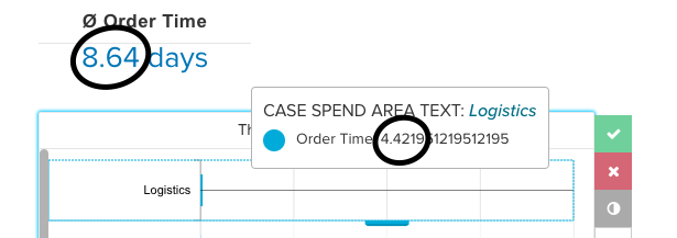
I am currently creating a P2P dashboard analyzing different times between activities. The dashboard includes a single number KPI component as well as column charts visualizing the different average throughput times between certain activities. Both the single number component and the column chart are calculated based on the following formula:
AVG(CALC_THROUGHPUT(FIRST_OCCURRENCE[Create Purchase Requisition] TO LAST_OCCURRENCE[Create Purchase Order], REMAP_TIMESTAMPS(Data_csv.EVENT TIME:TIMESTAMP, DAYS)))
The only difference is that the column chart uses different company areas as dimensions (Data_csv"."CASE SPEND AREA TEXT) while the number component only uses the formula above.
If I then select/ filter for one specific area in the column chart component, the number component updates but always shows a different number than the column chart.
I dont understand why two components display different times if they are based on the same formula. I guess it must have something to do with the way the average is calculated.
I am still a Celonis rookie so please excuse my question in case I oversaw something obvious.
Best regards
Jeff
I am still a Celonis rookie so please excuse my question in case I oversaw something obvious.
Best regards
JeffLogin to the community
No account yet? Create an account
Login with SSO
Celonaut Login Celonis ID LoginEnter your E-mail address. We'll send you an e-mail with instructions to reset your password.