

Hi I am trying to create a line chart to compare avg throuput time between two activities how it fluctuates between different months.
My Dimesion is this formula: ROUND_MONTH("AE_process_dataset_with_realistic_time_variabilities"."TIMESTAMP")
My KPI formula is :
PU_AVG (DOMAIN_TABLE ("AE_process_dataset_with_realistic_time_variabilities_CASES"."CASE ID" ),
(
CALC_THROUGHPUT (
FIRST_OCCURRENCE [ 'Arrival at A&E' ]
TO
LAST_OCCURRENCE [ 'Initial Assessment' ] ,
REMAP_TIMESTAMPS (
"AE_process_dataset_with_realistic_time_variabilities"."TIMESTAMP" ,
MINUTES
)
)
)
)
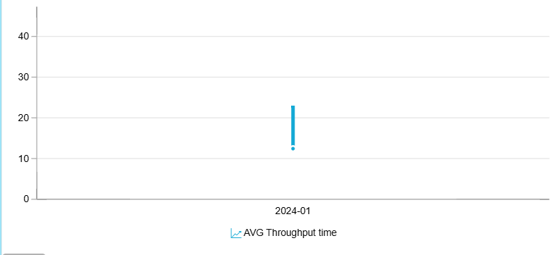
But I only get a graph for the first month:
Please can someone advise what I am doing wrong?