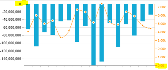
Hi all, Im creating an Credit note analysis - taking that into consideration all the values of my documents are negative: this causes that my graphs when Im looking at values and quantities look funny since the value 0 is not the aligned as the crossing for the X axis and the primary and secondary Y axis.
Is it possible to align the crossing of the X and both of the Y axis to 0? In this case, it will mean that the line will be above of the X axis, and all columns will be below.
Thank you!
Hey Stephanny,
If I understand your problem correctly you want to show the bar chart below the x-axis and the line chart above the x-axis. I think in this case it would actually make the most sense to implement both graphs as their own diagramm and layer them optically how you want it.
Another option you could explore is to adjust the primary axis to manual selection and (Component Options --> Primary Value Axis --> Manual Selection) set the values from +8000 to -140.000.000 and see what that does to your diagramm.
Best Regards,
Benedict
Thanks -
I would like to keep it in the same graph so your first proposal doe snot bring me forward. Setting up manually the primary axis value brings the negative values up: so the zero is aligned, but the negative values are decreasing vertically, which is a little counter intuitive, but it does the job.
Again, many thanks for your quick reply
Regards,
Stephanny

Reply