Hello everyone,

I am asking for support here for an application that I would like to do.

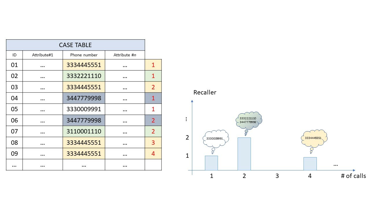
I have a CASE TABLE in which calls to a call center are recorded. Each line represents a received call.

The goal is to count the Recallers, i.e. those numbers that call several times in the period considered, and their frequency.

In other words, I would like to see how many people call twice, thrice, four times, etc.

I made a drawing to make better understood in which I recorded 9 calls made from 4 different numbers: I want to put them in a table or graph that shows me that there are 2 numbers that called 2 times, one number that called 4 times and a number only once. (I don't care about the phone number, I put up numbers just to show what I have available and what I want).


Could anyone help me set up a component with PQL?


Thanks


Question

Hi Enrico,


My 2 cents (which might not work):

  1. To get the number of time a phone number called: Create a Pull Up function using count, where a domain table on phone number is the first argument. Somehting like PU_COUNT(DOMAIN_TABLE('Phone number'),'case_table'.'ID')
  2. Then create a histogram on this KPI, to create the chart you want.


If you want this in a table, then simply add the PU_COUNT as dimention, and a COUNT_TABLE('CASE_TABLE') as KPI.


As said, not tested, but these might get your further.


If this helps, please mark my post as 'the answer' ;)


Hello,


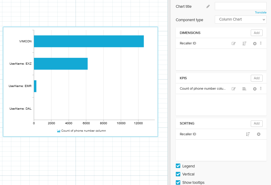
It's a little bit hard to visualise it because it seems to be 3 dimention chart. It would be combination of histogram (bucketing by number of calls) and also normal column chart with Caller ID as dimention and count of Phone number column.


Normal column graph looks like this:

Capture 


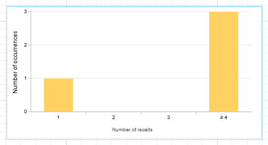
The histogram can be done by aggregating table by itself using PU_COUNT(DOMAIN_TABLE("_CEL_CASES"."CALLER_ID"), "_CEL_CASES"."PHONE_NUMBER"). Histogram would be OK if you would find way to view the caller id on the axis where the number of occurrences is.

Capture 2 

For now unfortunately I don't have idea how to combine those 2 chart types.

Hope it helped in any way.


Best regards,

Mateusz Dudek


First of all, thanks to both of the replies.

@deleted deleted maybe I expressed myself wrong, but I'm not interested in seeing the Caller IDs, but the output I would like is the second diagram you have attached (the one with yellow bars).

I also think that the Pull-UP function is the best solution, even if I don't have a DOMAIN_TABLE because the only tables I have are the ACTIVITY TABLE and the CASE TABLE (I don't have a table that collects apart from the numbers they call)

But I will try to extrapolate and create a table that collects the numbers (DOMAIN_TABLE) and then I will do as you advised me.


Thanks for the support. I appreciate it.


Enrico


Reply