Hello Celonis community,

I’m building a new view and I need to set-up a line chart with multiple lines.


Basically, calculating the same value but for different types and plotting them in differently colored lines.

In the analysis set-up I used to duplicate the metric for each type and force filter within the PQL metric for the specific type. Now, with the view set-up we can plot only one line, sicne we cannot add multiple Y-axis.

Is there a new way (ex. like the “hue” attribute in seaborn library for python) to do this? Or a tip workaround to be able to do it ?

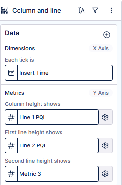
Firstly I agree that some of the more complex visuals from legacy views are hard to recreate with the new Views

I do however not see why you shouldn’t be able to add multiple lines into one visual.

I acknowledge the fact a multi line chart only supports one y-Achsis and therefore all lines must share that one. But for a intuitive understanding only lines with a similar metric definition should be grouped together IMHO. If you would do that you can just keep adding data to the chart after the first line by using the + button a second time. That would be the approach I would suggest. 

A chart type which would support multiple y-Achses however is the “Columns+ line chart” there you could enable a secondary Y Axis. And eventually even multiple lines. Not sure if you can tweak it with empty values to maybe cater what you are looking for.


Lastly a recommendation to only group metrics of the same context together. If your problem is just limited screenspace the new tab containers are a nice way to let the user switch between mutliple similar visuals in the middle of the dashboard.


Reply