Hello,


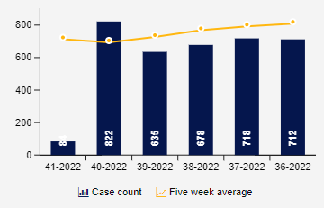
I small encountered a problem when I wanted to create a simple column chart with a trendline in an Analysis. I created a dimension with ROUND_WEEK(), a KPI with case count and a KPI with a MOVING_AVG for a count trendline of the last five weeks. Now, I only want to show the last six weeks using the limit rows / max. elements fields. When I do this and sort by the week dimension the most recent week is on the left, not on the right as it's usually common practice. Changing the ordering results in showing the first week in the data set, not the most recent ones. Then I tried to use a filter to only show the last weeks but then the MOVING_AVG calculation is wrong since previous weeks get filtered out.


Maybe someone can give me a hint 🙂 Thank you

column_chart

" When I do this and sort by the week dimension the most recent week is on the left, not on the right"


Maybe use an INT value for the week? that way will sort the higher (last) on the right, I guess

Although it will not work at the end of the year (except if somehow you get an int dimension that will include the year)


HTH


Thank you for your quick response!


So what I did now is I added a second dimension which assigns an empty character or a space ' ' to the last six weeks. Then I can sort by that second dimension which brings the most recent week to the right. Earlier weeks are now not getting filtered and the average calculation is accurate. I thought there might be a more elegant or native method but now I will just use this workaround.


Reply