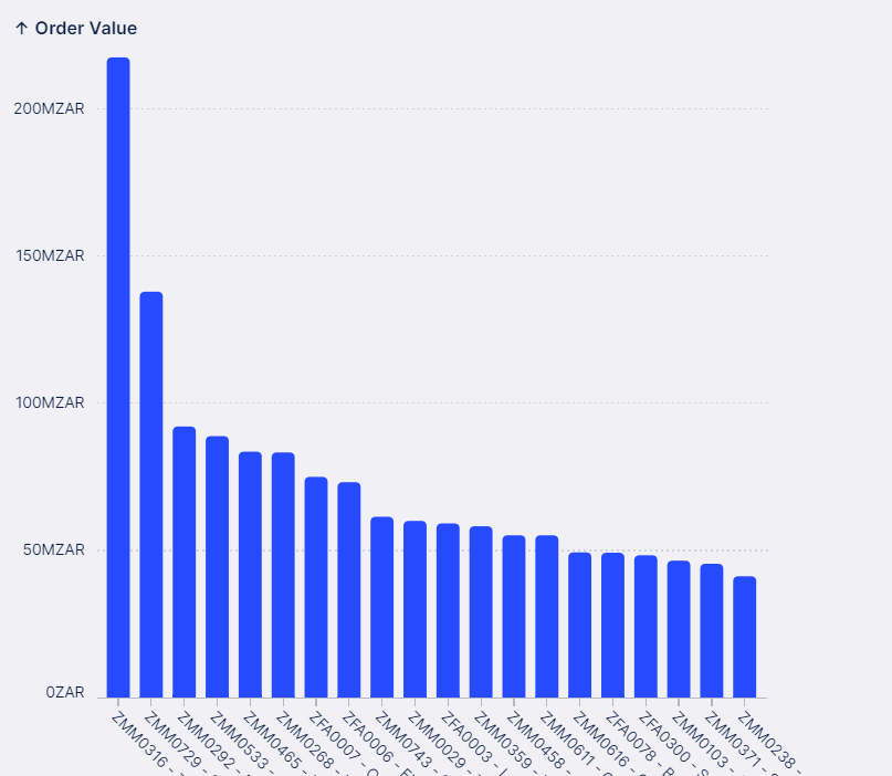
imageHi, Please help.

I want the blue bars to be broken up /split up into vendor names, so if there is 2 vendors their order values should add up to the total stacked on each other.

id: chart-c1c15300-c92b-4d97-8598-b90b8aa0069d

type: chart

settings:

  limit: 20

  sortBy:

    - id: f8639d07-e8cb-4f72-b6b4-16da36b1d74b

      field: KPI_PO_ITEM_THREE_WAY_MATCH_ORDERED_VALUE

      direction: DESC

      order: 100

  visuals:

    - id: 3eabb17a-7f5a-43d1-8d50-0d24bfa526e8

      mark:

        type: bar

        bandwidth: 0

      order: 100

      encodings: {}

  encodings:

    x:

      field: PO_ITEMS.MATERIAL_GROUP_MATERIAL_GROUP_TEXT

    y:

      field: KPI_PO_ITEM_THREE_WAY_MATCH_ORDERED_VALUE

Hi Bennita,

I undestood that you want to split each bar into multiple ones depending on vendor name.


technically one approach could be to break down your current KPI: KPI_PO_ITEM_THREE_WAY_MATCH_ORDERED_VALUE into:

KPI_VendorA and then KPI_VendorB

using CASE WHEN and e.g. SUM.


I would question what your endgoal here is though. This visualisation might be very valuable but only if your stacks are of very minimal number ( approx <=3 different vendor names) otherwise your visual become too complex to understand. e.g. how should a user distinguish 50 colors of 50 different vendor?


But also I do not know your data on detail and I might have misunderstood your problem.


Hi Thank you Manuel - I manage to get it right but I realize what you say, it becomes just too busy with all the names. Ill rather make another plan.

Thanks for your reply


Reply