Dear Celonis Community and especially Celonis developers.


For those who are not up to speed, 19th April new version of studio and “Enhanced views” were released for the training environments. (https://academy.celonis.com/pages/news-and-announcements and https://academy.celonis.com/courses/studio-view-building-experience ). From what it is indicated under one of the videos, it is going to be release for public production environments on 12th May of this year.


I have went on a deep dive (well as deep as I could in such a short time) into these new features and must admit that I am deeply concerned, to the point that I want to ask is this a practical joke? A late April fools of sorts?


I see that what is being implemented is not even a change or update to views, but a complete revolution. To such a degree that I am concerned about if and how will older assets work now? As the difference between old and new views are as big as it was between analyses and views when they were introduced. With a giant caveat being that views were a new component and not a complete replacement of analyses.


The main difference between old and new views being a more graphical way to move components around is by all means a great addition allowing for better graphical adjustment of components. I would even applaud how much it helps in YAML by cleaning the code from structure based on rows and columns, which themselves may be further split into rows and columns in the code, into a rather cleaner (in my opinion) listing of components with their set of coordinates as component properties.


But at the same time we are again completely limited to the rectangle space you are given in the tab (like in the analysis’), with no way to move components further down or set up any scrolling along the page. I even managed to force the components to go below by editing their coordinates directly in YAML and instead of enabling scrolling, it managed to completely break the tab like below:
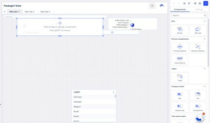
Picture1This was done just by giving larger then default values of coordinates of the land1 table you see on the bottom. The remaining components were not shrunk manually, they were taking the entire space originally, but this change to table coordinates forced shrinking of them by default. To make the issue even more apparent, the components on top cannot be moved down or enlarged by any way in the visual editor, because they are locked to their position by assumption that it’s the bottom of the page. At the same time, land1 table component is locked to the bottom and cannot be moved up, because it’s basically out of bounds completely breaking everything.


As such it completely removes one of the most useful parts of the views over the analyses: being the ability to scroll and by that merit include more or simply larger components. If I want to have 2 large graphs and a big table below them, I am forced to split them between tabs which completely misses the point.


Next I’ll concern myself with the most obvious and at the same time ironically less impacting issue: 25% of components were seemingly removed (32 in old views, 24 in new). Some additional of them supposedly available only through YAML, yet still not working even with new snippets, like the world map which syntax has been changed completely). I can overlook removal of things like Sankey diagram or waterfall chart as I neither utilized them much or consider them the most effective data visualization tools.


But removal of things like world map, or (most concerning) embedded views is something that is not only hard to accept, but even to understand. Even by trying to implement them by YAML it shows an error as “Views” are not an acceptable type of component. Even with direct snippet from documentation (Sic!):
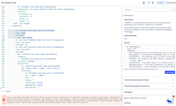
Picture2 

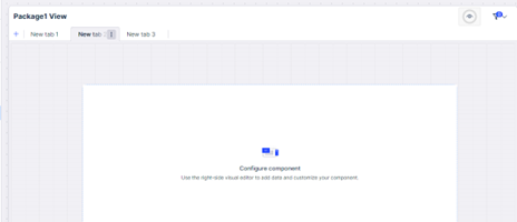
Additionally I see that tabs are now locked to the top of the page, so any design choice to have global KPIs on top of the page and subtabs below are now outside of any possibility.
Picture3 

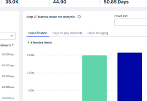
Additionally any subtabs within components (like below snip from AR Starter Kit assets) are now effectively null and void and unimplementable:
Picture4 

Furthermore I see that profile views are now also a thing of the past for some unclear reasons that I am not able to come up with nor presume.

Now the edition of components is seemingly easier with a sidebar instead of another window, but at the end of the day, for data selection a new window needs to open anyways, so I’d say it is not really a change. Additionally, at the same time the editing functionality seems to be more limited then in the old (current) views.

Also The filters sidebar is broken and not showing like on the video or is missing for some reason:

Picture5Here a comparison between the video version of views and the one in academy environment.


As neither embedded views, nor sidebar filters are available, this de facto disables a possibility for any toggleable sidebars. Additionally, how in such a setup would the placement of components work with togglable components (like a filter-sidebar)? In current setup, the rows and columns adjust themselves automatically with embedded view with filters component hiding or showing (working example in Accounts Receivables Starter Kit). In a proposed new design with set X/Y coordinates of components it seems to be a potential concern.


All of this brings to mind that it is not views, but a return to analysis’ as in practice the supposed new “enhanced views” assets are de facto refreshed analysis’, with same limiting of design space back into a small rectangle, with sheets/tabs on top of the page instead of bottom, and smaller amount of components (24 components in “enhanced views” + possible or not working additions in YAML vs 33 in analysis):

Picture6 

While comparing the “enhanced views” to analyses the former shows a newer refreshed graphical interface with the addition of the underlying YAML functionality. However, in comparison to current Views, it is certainly not an upgrade but a large step back that is deeply, deeply concerning.


If this is the update that will be pushed to production for everyone in 3 weeks as suggested, I am deeply concerned about any functionality that Celonis will be able to maintain. As this new version of views completely breaks the current production running apps based on views assets, while at the same time not bringing much to the table. I do not understand the reasons behind this supposed update. And as it does not seem to be an optional “upgrade” (or downgrade in my opinion) to a new component, but a replacement of views as is, it is furthermore concerning.


Kindest regards

Marcin

Hi Marcin,


great comparison.

Honestly speaking I am still a fan of analyses and the "easy" way of just creating a nice looking dashboard in a very fast way but I totally understand your concerns and I am also concerned as we are also using more and more views (Starter Kits, several apps and own implemented views) within our environment.


Especially the question how do views behave after release of the new studio that are using components that are no longer supported should be addressed beforehand.


I cannot imagine that they haven't thought about this. On the other side would be a mess if views would now behave different based on its creation date like having a view 1.0 vs. view 2.0.


Lets see what will happen but this might be a complete showstopper.


Dear @marcin.konop13 ,


First of all, let me address the most important concern and assure you and others, we won’t break any in production running apps! Your existing content will not change in any way and you can (for a long time) decide which of the dashboarding tools you want to use, by switching back to the previous view editing or continue to create Analysis. 


Second, we are not ‘done’ yet with our development and we are aware of gaps. We are actively working on resolving those, so there will be many releases following after May 13th. More below.


Third, thank you very much for the detailed feedback, this helps us to make our communication clearer.


Let me address the topics you raised 1 by 1:


  1. Why did we invest in this? - Even though we are humorous people working in Product and Engineering, no, of course this is no joke 🙂 We took our user feedback from the past 3 years about the difficult view editing experience very seriously.
    1. As announced at Celopshere in November 2023 we invested (and will continue to invest) heavily in lowering the entry barrier for our users to build UIs and dashboards and enabling them to leverage the latest platform capabilities.
    2. The first version of Views was and is hard to adopt and to be leveraged to create value by our users due to the steep learning curve for building and missing process mining capabilities compared to Analysis.
    3. This is why our key priority is to deliver a solution that is intuitive and easy to use, in many aspects more similar to Analysis (like you also pointed out at the end of your post), while incorporating all the latest platform capabilities, such as Augmentation, OCDM process analysis or linking views (formerly known as profile views) for better user flows, to just name a few.
    4. We have run an extensive Limited Availability program with over 89 customers who provided us graciously feedback to define a feature set and bring the usability to a level that first productive dashboards can be built successfully. While we are not able to cover everything yet, it will reduce the learning curve and bring many users to the latest platform capabilities. And we will continue to close the gaps as fast as possible to enable also more advanced set ups, like you already did in legacy Views.
    5. What will be released on Monday, May 13th is just the beginning. Please also see the pre-release notes, outlining the changes (also additional ones that are coming with the general availability vs. what is currently on the training cluster) and explaining that your work will not be impacted. 
  2. How will older assets work? -The same as today!
    1. When you create a view, we’ll use the new view editing experience by default. You can switch to the old editing experience if you want to go back to the way it used to work. Simply click on the button on the top right to switch to the old editing experience. We recommend you to use the new editing experience to enjoy the simpler flows and latest features, when already possible. However, we do still have some gaps to close as you noticed and rightfully pointed out. To be as transparent as we can be, we added a Studio Feature Availability Matrix to give you an overview where we currently stand and what we plan to address with urgency.
    2. Studio Analysis hasn’t changed, so you can continue to use that in the same way as before.
    3. All your existing (already created) assets will be unchanged and when you go to edit you will edit them as of today. 
    4. We will further offer support and maintain legacy Views and Analysis until we are sure to cover all needs and ensure a smooth migration of existing content - this is far in the future and there is no rush!
  3. Layout changes - Scroll is coming with GA in May!
    1. The drag and drop layout is indeed one of the core changes we opted in for to allow for an easy drag-and-drop experience to place, resize and rearrange components. We are glad you like it!
    2. You will be able to change the layout from a ‘Scale-to-Fit’ to a ‘Custom Height’ layout. The ‘Scale-to-Fit’ is what you are currently seeing in your training team. The benefit is that you will always see the same no matter what screen sizes you are opening the View. The ‘Custom Height’ on the other hand will allow you to define a height and this will add a Scroll if that cannot be displayed at once on the screen.
    3. By the way, in Analysis you are also not limited to the Fullscreen option, but in the Sheet settings you can change to ‘Fixed Width’ to define the height of the page and add more components.
  4. Availability of components
    1. We are aware of our gaps and I can assure you that it is our utmost priority to drive the development of the remaining components. In the meantime, we want to be as transparent as possible to give you a heads up what's already there and what not, please see our Studio Feature Availability Matrix for details
    2. And most importantly, we do not want to get in the way of any implementation that is in need of capabilities that we are not able to cover yet. This is why you always have the choice to switch back to the old view editing experience or create an Analysis until we are able to address your needs!
  5. Tabs within Views coming soon (Q3)
    1. The new Views come with in-built tabs, similar to how Sheets worked in Analysis, the difference they are on top vs. bottom of the page.
    2. We do have it on our short term roadmap to also offer so called ‘Container Tabs’, which enable you to place containers on your view with tab-able content.
  6. Profile Views set up is now simplified by just linking Views - already there!
    1. To open a view providing more details when clicking on a table cell you can now simply link any view, without the need for a definition of a Record ID. The the flow will allow for more flexibility that before required rather complex workarounds. You can find it described in our documentation about Linked Views.
  7. Filter sidebar - coming with GA in May!
    1. Not all changes are already live in the training teams. The filter sidebar, as well as making views scrollable or further improvements on variables will only be released on May 13th.
    2. As you correctly saw in the video the filter sidebar will be an in-built capability that will no longer require YAML nor javascript skills to achieve a toggleable sidebar for placing filters.
    3. After careful consideration with our design team, we decided to for now not offer vertical collapsible content because we do not consider it a design best practice. Based on this we will overhaul the design of the Celonis provided Marketplace apps.
  8. To close, I want to iterate again on the fact that 
    1. It is optional. When creating a view you can choose between the two view versions. Or create an Analysis.
    2. It won’t break any running apps and dashboards.
    3. And to address @dennis.pflug comment - we are also already actively reworking the Marketplace content provided by Celonis so you can start new implementations in the simplified editing experience. Once we closed more feature gaps, we will also provide migration tooling if you decide to move your own view implementations to the new experience.


Thank you again for trying out the new product right away and raising your questions with us. So we had the chance to address them. I do hope I could create some clarity and relieve your concerns. 

If you have more questions, please do not hesitate to continue in this thread - and I am also more than happy for a 1:1 feedback session!


All the best

Sabeth, on behalf of the Studio Product Team


Hi Marcin,


great comparison.

Honestly speaking I am still a fan of analyses and the "easy" way of just creating a nice looking dashboard in a very fast way but I totally understand your concerns and I am also concerned as we are also using more and more views (Starter Kits, several apps and own implemented views) within our environment.


Especially the question how do views behave after release of the new studio that are using components that are no longer supported should be addressed beforehand.


I cannot imagine that they haven't thought about this. On the other side would be a mess if views would now behave different based on its creation date like having a view 1.0 vs. view 2.0.


Lets see what will happen but this might be a complete showstopper.

Hi Dennis.


Oh by all means. I love analyses as well. They are perfect for what they are. Especially good for new users and for citizen developers. I wouldn't want to get rid of them in any way.


What I am concerned however is the changes to views. I like analyses for what they are just as well as I like the views for what they are. A robust framework for creating more detailed, proffesional apps that can enable really advanced analytics.


In my opinion there is space for both. And if this new enhanced views was a seperate component or a replacement for analyses, I would be by all means supportive of that. Because in my opinion both serve the purpose of simple (not mistake with simplistic) and easy way to create dashboards. An inclusion of YAML layer additionally allowing for better archiving and developing.


But replacing the advanced and really detailed asset of views with something more akin to analyses (at least in current version) is something that I am very concerned with and would really like to avoid.


Since I started working with Celonis back in 2018 I must admit all the changes until now were of very successful and positive impact. Even if early implementation of views were a bit problematic. This is however something I see in its current form as an unnecessary step back.


Like you mentioned I am hopeful, but that is also why I wrote this post. Not because I want this to fail or take pleasure in criticizing others, but because I am deeply concerned about the state of it.


Kindest

Marcin


I also want to weigh in this discussion as a participant of Limited Availability phase who has made first hands on experiences and is not a Celonis Employee.


The important thing which Sabeth clearly stated: everything is optional. In our environment we have Analyses, Old Views and the new Views all next to each other. And obviously the existing assets are still working fine and can be maintained further. When I need to create something new I can freely choose between all three.


However, already today where feature parity is not yet reached my first choice would be the improved "new View". The biggest benefit for me is that I can create ad hoc PQLs as in Analyes but can also decide to store it centrally in a knowledge Model. For me it gives the flexibility and allows "quick and dirty" as Analyses do but once you mature with it it is much easier to maintain knowledge centrally in a KM and not have stored formulas and variables in every analysis like the Views do. To me it feels like the best of both worlds and is perspectively able to cater both ends of the spectrum between analysis and View.

Since years I was honestly puzzled how annoything the Development Experience was for the old Views. A lot of thos eare being solved now.


There is an argument to be made how much the naming of this component is fitting as this is definitely a different asset type than the "old" View. But I guess in general in IT and especially with Celonis we all know the product names are kind of confusing and everchanging. I would guess that they did not want to introduce yet another name for another "Frontend/Dashboard" Component again.


Also obviously as of right now the feature parity is not fully reached and not all features they want to implement are implemented working perfectly. E.g. the scrollable View that you whished for and Sabeth mentioned will come soon. In general I am fairly optimistic Celonis will improve till it becomes GA and then in rest of year as well.


So in summary:

  • I do consider it a rather positive impact.
  • Rest asured that it is your choice if, when and how to switch.


IMHO no need to be feel unrest about the Launch of it with GA. Just test the water once it is there.


Dear @marcin.konop13 ,


First of all, let me address the most important concern and assure you and others, we won’t break any in production running apps! Your existing content will not change in any way and you can (for a long time) decide which of the dashboarding tools you want to use, by switching back to the previous view editing or continue to create Analysis. 


Second, we are not ‘done’ yet with our development and we are aware of gaps. We are actively working on resolving those, so there will be many releases following after May 13th. More below.


Third, thank you very much for the detailed feedback, this helps us to make our communication clearer.


Let me address the topics you raised 1 by 1:


  1. Why did we invest in this? - Even though we are humorous people working in Product and Engineering, no, of course this is no joke 🙂 We took our user feedback from the past 3 years about the difficult view editing experience very seriously.
    1. As announced at Celopshere in November 2023 we invested (and will continue to invest) heavily in lowering the entry barrier for our users to build UIs and dashboards and enabling them to leverage the latest platform capabilities.
    2. The first version of Views was and is hard to adopt and to be leveraged to create value by our users due to the steep learning curve for building and missing process mining capabilities compared to Analysis.
    3. This is why our key priority is to deliver a solution that is intuitive and easy to use, in many aspects more similar to Analysis (like you also pointed out at the end of your post), while incorporating all the latest platform capabilities, such as Augmentation, OCDM process analysis or linking views (formerly known as profile views) for better user flows, to just name a few.
    4. We have run an extensive Limited Availability program with over 89 customers who provided us graciously feedback to define a feature set and bring the usability to a level that first productive dashboards can be built successfully. While we are not able to cover everything yet, it will reduce the learning curve and bring many users to the latest platform capabilities. And we will continue to close the gaps as fast as possible to enable also more advanced set ups, like you already did in legacy Views.
    5. What will be released on Monday, May 13th is just the beginning. Please also see the pre-release notes, outlining the changes (also additional ones that are coming with the general availability vs. what is currently on the training cluster) and explaining that your work will not be impacted. 
  2. How will older assets work? -The same as today!
    1. When you create a view, we’ll use the new view editing experience by default. You can switch to the old editing experience if you want to go back to the way it used to work. Simply click on the button on the top right to switch to the old editing experience. We recommend you to use the new editing experience to enjoy the simpler flows and latest features, when already possible. However, we do still have some gaps to close as you noticed and rightfully pointed out. To be as transparent as we can be, we added a Studio Feature Availability Matrix to give you an overview where we currently stand and what we plan to address with urgency.
    2. Studio Analysis hasn’t changed, so you can continue to use that in the same way as before.
    3. All your existing (already created) assets will be unchanged and when you go to edit you will edit them as of today. 
    4. We will further offer support and maintain legacy Views and Analysis until we are sure to cover all needs and ensure a smooth migration of existing content - this is far in the future and there is no rush!
  3. Layout changes - Scroll is coming with GA in May!
    1. The drag and drop layout is indeed one of the core changes we opted in for to allow for an easy drag-and-drop experience to place, resize and rearrange components. We are glad you like it!
    2. You will be able to change the layout from a ‘Scale-to-Fit’ to a ‘Custom Height’ layout. The ‘Scale-to-Fit’ is what you are currently seeing in your training team. The benefit is that you will always see the same no matter what screen sizes you are opening the View. The ‘Custom Height’ on the other hand will allow you to define a height and this will add a Scroll if that cannot be displayed at once on the screen.
    3. By the way, in Analysis you are also not limited to the Fullscreen option, but in the Sheet settings you can change to ‘Fixed Width’ to define the height of the page and add more components.
  4. Availability of components
    1. We are aware of our gaps and I can assure you that it is our utmost priority to drive the development of the remaining components. In the meantime, we want to be as transparent as possible to give you a heads up what's already there and what not, please see our Studio Feature Availability Matrix for details
    2. And most importantly, we do not want to get in the way of any implementation that is in need of capabilities that we are not able to cover yet. This is why you always have the choice to switch back to the old view editing experience or create an Analysis until we are able to address your needs!
  5. Tabs within Views coming soon (Q3)
    1. The new Views come with in-built tabs, similar to how Sheets worked in Analysis, the difference they are on top vs. bottom of the page.
    2. We do have it on our short term roadmap to also offer so called ‘Container Tabs’, which enable you to place containers on your view with tab-able content.
  6. Profile Views set up is now simplified by just linking Views - already there!
    1. To open a view providing more details when clicking on a table cell you can now simply link any view, without the need for a definition of a Record ID. The the flow will allow for more flexibility that before required rather complex workarounds. You can find it described in our documentation about Linked Views.
  7. Filter sidebar - coming with GA in May!
    1. Not all changes are already live in the training teams. The filter sidebar, as well as making views scrollable or further improvements on variables will only be released on May 13th.
    2. As you correctly saw in the video the filter sidebar will be an in-built capability that will no longer require YAML nor javascript skills to achieve a toggleable sidebar for placing filters.
    3. After careful consideration with our design team, we decided to for now not offer vertical collapsible content because we do not consider it a design best practice. Based on this we will overhaul the design of the Celonis provided Marketplace apps.
  8. To close, I want to iterate again on the fact that 
    1. It is optional. When creating a view you can choose between the two view versions. Or create an Analysis.
    2. It won’t break any running apps and dashboards.
    3. And to address @dennis.pflug comment - we are also already actively reworking the Marketplace content provided by Celonis so you can start new implementations in the simplified editing experience. Once we closed more feature gaps, we will also provide migration tooling if you decide to move your own view implementations to the new experience.


Thank you again for trying out the new product right away and raising your questions with us. So we had the chance to address them. I do hope I could create some clarity and relieve your concerns. 

If you have more questions, please do not hesitate to continue in this thread - and I am also more than happy for a 1:1 feedback session!


All the best

Sabeth, on behalf of the Studio Product Team


Hi Sabeth


Thanks a lot for your quick response! Hope my criticism wasn’t taken personally.

I have been working with Celonis since waaay back in 2018 and I must admit it was the first time I was really concerned about the state/development of the product.


I had engaged with what I saw available in the training environment and my concerns were (as I assumed) that it was already the end result which will replace the views (as I didn’t see any option of switching to old views). It is good to hear that things are still in development and the new views are an optional thing.


Let me as well respond to your points:


1.      By all means I understand and support the approach to lower the entry bar into development. I think it was quite a large hurdle for many to overcome after introduction of views way back when. And taking into consideration things like citizen developer programs it is a great direction. My concern was that it would completely replace what has already been developed and as you could’ve read from my post I saw it as a huge limitation. In my opinion while lowering the entry bar is a good idea, I would be concerned if at the same time it would lower the opportunity ceiling, disabling or limiting development possibilities.


2.      That is wonderful to hear. I was afraid that some of the celonis marketplace assets would no longer be applicable, not to mention assets we created ourselves.


3.      Brilliant, then that point is null and void if its coming in an update.


4.      Yes. That was also a large concern for me. Especially seeing as not all components were fully developed in current (old) views and many of them could only be edited in YAML, now adding to that the fact that the syntax is changing for many of them (if not all) it is a bit concerning how will that impact the documentation. Additionally some limitations are in my opinion a bit too strict (like only 4 categories for pie charts, analyses are working fine with no limits)


5.      Null and void like 3 in that case.


6.      Oh perfect. Was concerned as there were no training materials available for me to look it up in. I just noticed that in the new setup views are either regular or live, with no profile views option


7.      That is good to hear. Regarding 7.3 I understand your concern, albeit I saw the collapsable sidebars and content as a rather elegant and interesting part of the structure. A bit difficult to set up, but impactful nonetheless. Sidebar filters should fulfil most of the needs those components were bringing to the table, but I think in some niche scenarios they might be useful.


8.      And that is the most important thing that had me quite scared. That it would not be optional like the switch from analyses to views (maybe disregarding advanced features like multi eventlog which are not cooperating with analyses so well).


Thank you kindly for your response. I will certainly come back after playing around a bit more with it, and experiencing the training materials as they are released (or were released yesterday) especially with our own data and comparing results to old setups. I think developer enablement is great direction to go. It is something that is also very high in our priorities as we focus currently on our citizen developers and including more people in creation of assets within the company.


Thank you once again for your response and all your hard work. I am really happy to see that Celonis is developing and going forwards.


All the best to you and the team!

Marcin


Reply