Solved

change column chart settings

  • April 11, 2022
  • 3 replies
  • 16 views

Forum|alt.badge.img+14

I'm creating the column chart and I'd like to change the intervals between numbers on the vertical axis. Could you please tell me the way?

Best answer by janpeter.van.d

Hi @e.n,


If you are working in an Analysis (so not an Studio App), you can define the number of ticks.

Right-click on an element to go to its settings, and select here 'Primary Value Axis'. Here on the bottom, you can deselect the auto-ticks and define the number you want (see screenshot below).
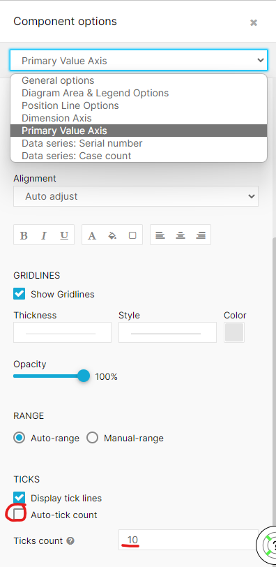
 

ticks_settingsticks_example 

Kind regards,

Jan-peter

3 replies

You should use COUNT and CASE WHEN creating the bucketing the you would like in the dimension field. An alternative could be using an Histogram but the drawback is that you can only show one KPI there.


janpeter.van.d
Level 12
Forum|alt.badge.img+26

Hi @e.n,


If you are working in an Analysis (so not an Studio App), you can define the number of ticks.

Right-click on an element to go to its settings, and select here 'Primary Value Axis'. Here on the bottom, you can deselect the auto-ticks and define the number you want (see screenshot below).


ticks_settingsticks_example 

Kind regards,

Jan-peter


Forum|alt.badge.img+14
  • Author
  • Level 6
  • April 18, 2022

Hi @e.n,


If you are working in an Analysis (so not an Studio App), you can define the number of ticks.

Right-click on an element to go to its settings, and select here 'Primary Value Axis'. Here on the bottom, you can deselect the auto-ticks and define the number you want (see screenshot below).


ticks_settingsticks_example 

Kind regards,

Jan-peter

@1460067637  @janpeter.van.d 

Thank you for your reply. Follow the steps you have given me , I could deselect the auto-ticks and define the number I want.

I really appreciate your help.