Hello!


i have a histogram chart where i am counting the number of cases bucketed into different completion rates (0 - 20%, 20 - 40%, 40 - 60% etc.). I would like to colour all the cases that have more than a 60% completion rate, but any formatting i put it seems to be only possible on the KPI side (i.e. number of occurrences).


This also affects the position line option --> it turns out horiontal, rather than vertical.


Anyone has a workaround?


Best,

Dom

Hello Dominic.

for the part: " I would like to color all the cases that have more than a 60% completion rate " do you mean buckets(bars) for > 60% ?

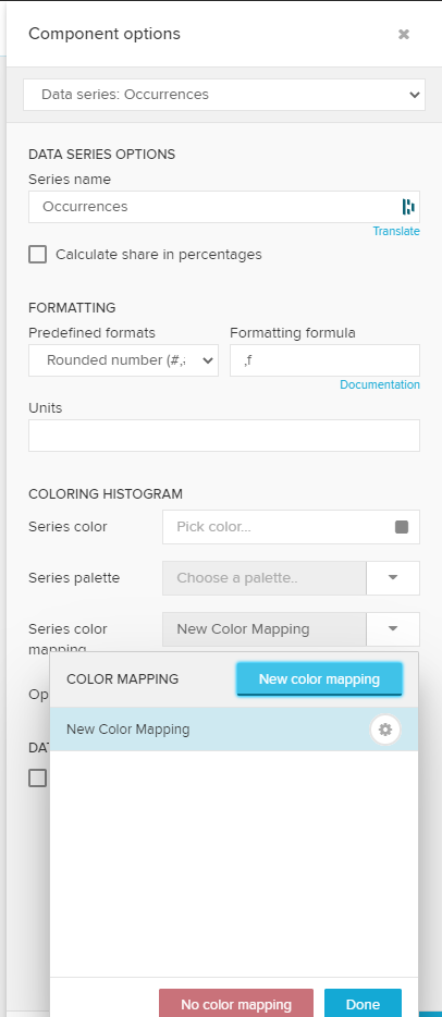
If yes, you can use the Series Color Mapping, inside Histogram>Data Series: Occurrences.

About the position line, can you post a screenshot?


EDIT: adding instructions:

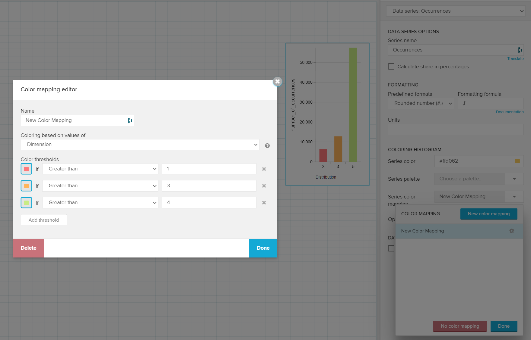
Go to the Histogram settings >> Data Series Occurrences >> Series Color Mapping (New Color Mapping) >> Coloring based on values of DIMENSION >> Define the values/color you want.


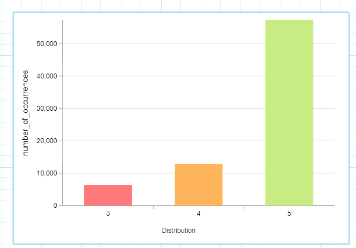
Here is an example:

2021-06-14 14_44_05-2021-06-14 12_00_17-Data _ Process Analytics 


Reply