I want to create a bar or line chart where I can compare the development of a KPI in the current and previous year.
I saw that somebody suggested to create a filter for the respective year. This might help to switch back and forth. However I want to show it simultaneously in one graph.
Appreciate any help.
Best answer by denis.pede12
Hi Philipp, I encountered the same problem a week ago and did the following workaround:
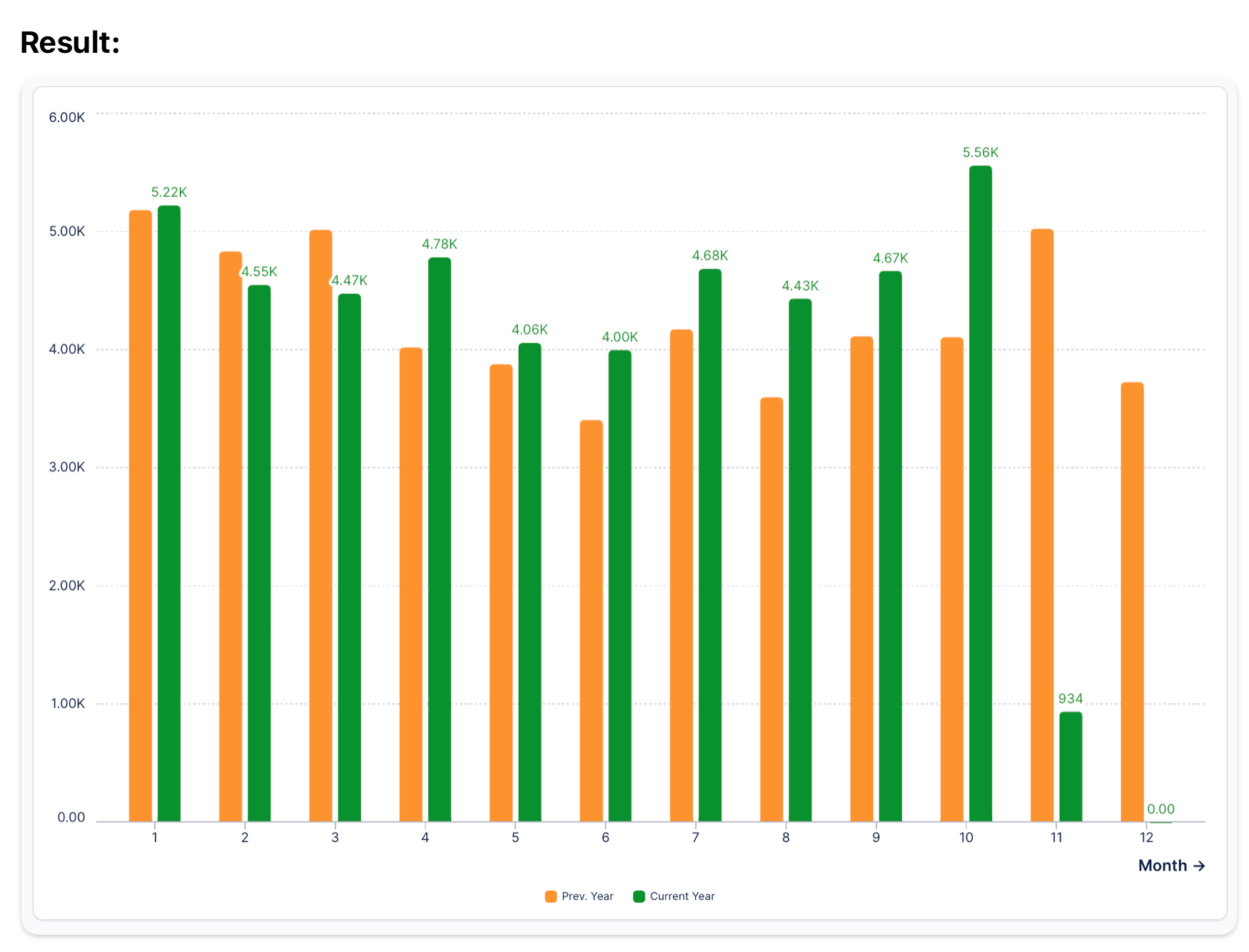
Result:
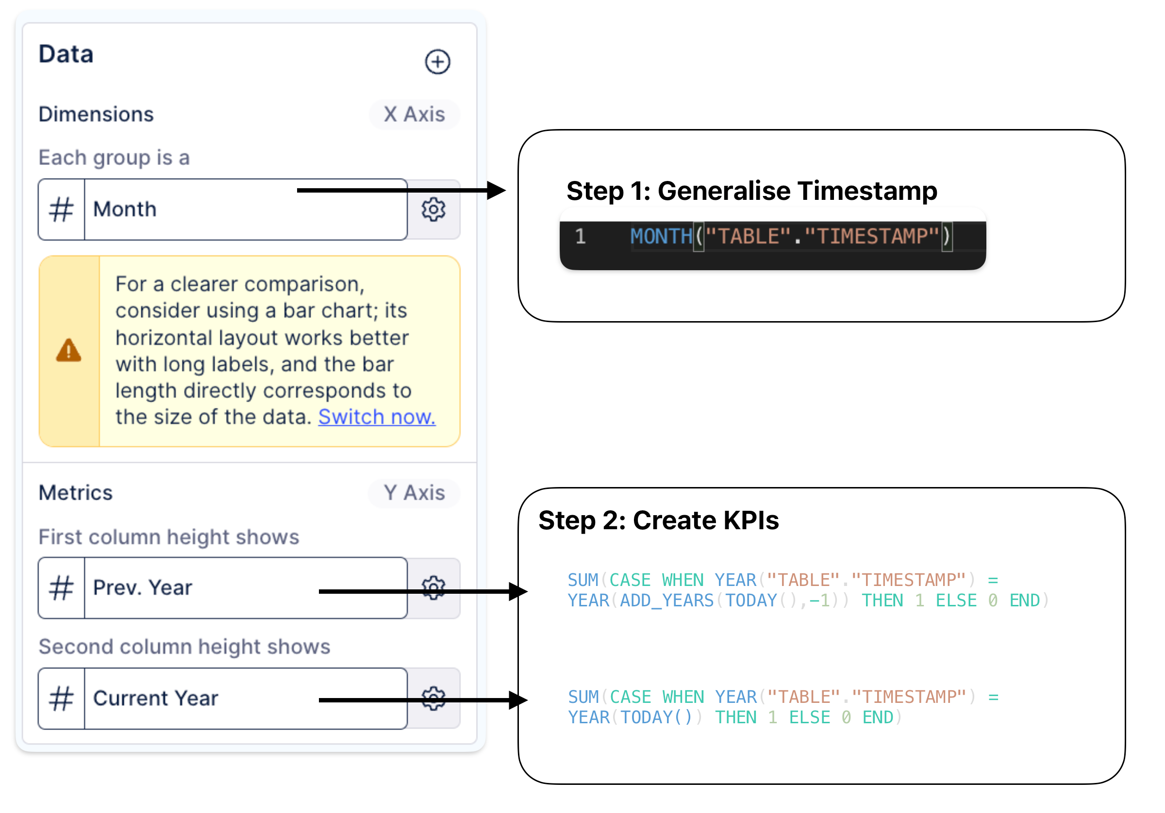
Approach:
I had to do it for a quite simple KPI and it worked for me. I could imagine that this approach does not work for all KPIs. However, feel free to give it a shot and let me know whether it worked for you!
Hi Philipp, I encountered the same problem a week ago and did the following workaround:
Result:
Approach:
I had to do it for a quite simple KPI and it worked for me. I could imagine that this approach does not work for all KPIs. However, feel free to give it a shot and let me know whether it worked for you!